This is Doodle Crew member "V" -
Today I'm going to give you a drive by introduction to my favorite graphics program, CorelDRAW Suite. A good 95% or more of the printing, editing and enhancing the graphics I use before I print and color is done in CorelDraw. I have used this program through 12 software updates. Even in computer terms, that's a long time. I first found CorelDraw in version 3 around 1995. I think I got the disk in a CD-ROM multimedia kit. For those of you who remember the early days of CDs, yeah, I'm that sort of old. I am 100% self taught with this program, so what I'm going to show you may not necessary be the easiest way to do things, but it's my way. I think if you'll give the program and its many functions a try, you might find you like it.
In this tutorial, the first of two, we are going to cover converting your .jpg image to a .png type image with a transparent background. This is going to let us tuck the text or even another image behind the image, giving it depth. In the second tutorial, I'll cover using CorelDraw to create a vector image, a swirl to add with text to give the impression that our fine Dudley is an Olympic calibre skater and did some fancy footwork to skate a greeting. I'm using the new SkateDragonB image from Dustin's new release.
Because I have a CorelDraw Suite, it's a package of programs including a program comparable to Adobe Photoshop Elements. Corel's version is called Corel Photo-Paint. In general, the programs are pretty much the same. The tool we'll be using is the magic wand, which functions the same in both programs. I have opened the image in Corel Photo-Paint.
Click on the magic wand tool (small circle) and set the Tolerance at the top to around 5. Don't see the magicwand on your tool bar, the W key on the keyboard turns it on. Type and see! I have four here and that worked really well. Make sure Anti-Alias is turned off. It's the circle with the red line through it next to the tolerance setting (larger oval). This is what it looks like when it's turned on.
On the opposite side of the Photo-Paint window, you have the Objects bar.
You can see our image listed with the name "background". Hover over this and you'll get a little popup that says "background active, opacity 100%", which is Corel's way of telling us what we already knew.
You can't see through this image. To turn opacity off, simply click on the layered boxes to the side of the "Background" title on the layer. Its things like this that make Corel stand out for me. Doing the same thing in Photoshop Elements takes a couple of steps. I prefer the click and go method.
We are now ready to do away with the white background. Using the magic wand, click on the white background area of the Dudley image. You will see what is commonly refered to the "marching ants" appear around the white area.
Press the DELETE key and the white drops away to be replaced with a white and grey checkerboard pattern. Where ever you see this checkerboard image, that portion of the image is now transparent.
Scroll around the image and look for areas that are not connected to the main background image, but are areas where you want the image to be transparent, like between the blade areas on the skate and that spot under Dudley's arm, just above his tail, or even the loop in the skated scroll.
When you have all the little fiddly areas cleared of white background, it's time to save the image. If you do a straight save and keep the image as a .jpg, the original format you snagged from the Doodle Dragon Studios site, you have just taken all your efforts and chunked them out the window. The .jpg format does not allow for transparent images, so we'll need to convert this image to a format that does allow for them. In this case, .PNG is the way to go.
Under File, choose the option for Save As.
The save as box has a drop down list of all the available image formats you can use. Select PNG - Portable Network Graphics and click Save.
You may see a prompt that Objects will be merged with the background. That's fine. click OK.
The Export to PNG window will come up next. For the most part, the default settings are what you want. The main thing to look for here is the "Transparency" checkbox under Settings on the right. Make sure there is a check in the box. Click Okay and you have a transparent image ready for layering!
Next up, we'll talk about the CorelDraw program in the suite and create a simple vector graphic to combine with our now transparent Dudley.
Think you may want to give Corel a try? Corel offers a free trial on their site and you can get the Home and Student version of the software can be picked up on Amazon for under $60.
I hope you enjoyed this tutorial, I will be working on a second one for you.
Showing posts with label tutorial. Show all posts
Tuesday, January 15, 2013
Thursday, January 12, 2012
Pike's Academy - Make a Bow
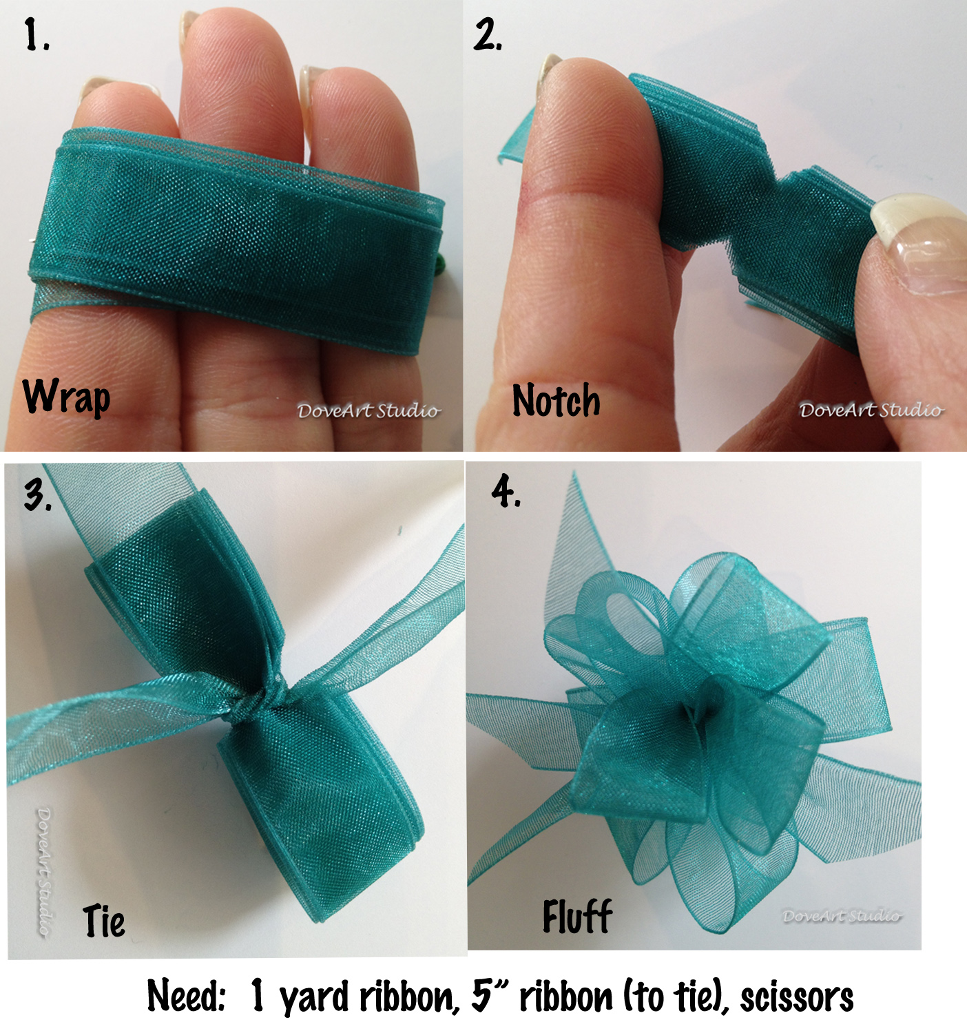
How about a little something from Pike Academy? Did you know every now and then we throw out a little tutorial? You can access them anytime by clicking on Pike's Academy on the left hand side of the blog. Here is a little tutorial on making a bow to "top off" that project you are making.
Don't just make them for cards...how about the center of flowers, or a 3D turkey tail feather or bunny butt....so many possibilities. Use less ribbon for thicker ribbons or smaller bows. Make the size smaller by wrapping the ribbon around 2 fingers or make it huge by wrapping 4. Play around with it...easy and fun!
Labels:
tutorial
Tuesday, January 10, 2012
It's rough and in testing phase...
But here's a PDF file of how to draw a monkey...
It can be printed, opened in Acrobat reader or for those with an ipad in ibooks.
http://www.doodledragonstudios.com/H2DMonkey.pdf
Added some new art to catch up as well as a few new ones for January 2012 members
Dustin
It can be printed, opened in Acrobat reader or for those with an ipad in ibooks.
http://www.doodledragonstudios.com/H2DMonkey.pdf
Added some new art to catch up as well as a few new ones for January 2012 members
Dustin
Labels:
How to draw,
new art,
samples,
tutorial
Thursday, November 17, 2011
Tutorial - Building a Doodle Book
This tutorial was written by Veronica, one of my DoodleDragon Crew, and I thought I would share. We would love to see what you can do with it. Feel free to post a link to your creation!!
It seems to be getting that time of year when I need to have something little handy to distract my little monsters. Sometimes it is in the car, a doctor's office or even a break from an afternoon of boredom. Angry Birds only works for so long and then I have to resort to other measures. It has to be something small, portable (fits in my purse) and fun. What's more fun than a doodle book and a pouch of colored pencils? My girl monster loves it when I pull out a new doodle book for her coloring pleasure.
Doodle books are quick and easy to make, particularly when you snag a group of images like the 100 Days of Christmas special Dustin is offering up. Grab your images, load up Photoshop Elements and let's get busy! Don't have Photoshop Elements? You can download a free trial of the new version 10 from the Adobe Website (http://www.adobe.com/cfusion/tdrc/index.cfm?product=photoshop_elements&loc=en_us&crosssell=selected )
I will be using Photoshop Elements 9 for this tutorial, so if you download the free trial, keep in mind that things might be in a different location.
Let's get started making Doodle Books! Start by creating a new file for your doodle book.
click FILE -> NEW
Set your Width, Height and Resolution. The resolution by default is 72, change this to 300. The files you download from the Doodle Dragon site are 300 pixels per inch (or DPI), so you want your starting resolution to be the same. When I'm making Doodle Books, I prefer my background to be white rather than the default transparent. You can go either way.
Choose a name for your file and click OK.
Now you have a nice blank page the size of a regular sheet of paper. To make a quarter page doodle book, I start by establishing some guides. Guides are lines that will appear in your file, allowing for easier layout of your images. These lines won't print.
Click View -> New Guide
First set a horizontal guide at 5.5
Click Okay.
Repeat the process to set a veritcal guide at 4.25
Your page is now divided into quarters
Your page should look like the image above. At this point you're ready to add your images. If you have never combined images into a single file, it is not as hard as it sounds. Start by opening the first four images from the 100 Days collection.
In the file for image 001, click Layer –> New –> Layer From Background.
Give the image a name. I used 001 so I could keep track of my images as I go along.
Click Ok.
The image in the LAYERS bar to the right will name change name from “background” to 001 (or whatever name you used.)
Now you're ready to drop your image into your doodle book file. Once again head back to Layer. This time, select Duplicate Layer.
The image name starts out as XXX copy until you select a file other than the one you are currently viewing. Once you select your Doodle Book file, the image will drop the “copy” moniker.
Select the doodle book file name you created at the beginning from the document drop down list and click OK.
Check out your Doodle Book file. There is image one in the upper left hand corner of the page.
Not an ideal location for binding, however. Click on the image and drag it so that it is centered in the square created by the grid lines. Remember to give yourself enough room at the top of the area to bind the book later on.
This image still looks a little small to me. Click on one of the corner boxes that appears when you click on the image. You'll see a box outline appear with a check mark and a circle. You are now ready to alter how your image appears. Just under the top bar, you have some new options.
W is width, H is height of course. Type in a number, any number and the image will resize by that percent. If you type in 25%, your image shrinks, type in 125% and the image grows. The 'Constrain Proportions' keeps the file square.
I adjusted to 125%. You can keep playing with the numbers here until you click either the green check mark to accept the settings, or the red circle to discard them.
Now that you have the file in place, repeat the steps to add in images 002, 003, and 004. Move the images to the spot on the grid by dragging them to the location you want them.
Check out image 004, of the snowman and the beaver. Does it look a off compared to the other images? Let's rotate it and fill the space a bit. There is no fast rule that every image has to be in the portrait orientation.
Click on the image. This time, we're going to adjust the rotation.
Rotation is done in degrees. Remember basic math? There are 360 degrees in a circle. To turn the image on its side, go 90 degrees.
Click the green check mark and the image rotates. Resize and rotate the other images as needed.
Print and trim. You have four Doodle Book pages! You have two options at this point, you can start at the beginning and repeat until you have the number of pages you want, or you can try out the magic of layers.
I mentioned the Layers box earlier when we were creating a layer from the background image. If you 'll notice down the right hand side of your Doodle Book file, there are five images listed now. The four 100 Days images and an image for the background. Let's build page two right in the same file. Open images 005 through 008 and add them to your Doodle Book file using the steps we've done above. Go on. I'll wait.
Ready? Do you have them all stacked up looking a bit like this?
That happens when all of your layers are visible. Doesn't work very nicely does is? Head on over to the Layers panel on the right.
In the Layers Panel, you'll find your list of images. The little thumbnail even shows where the image is sitting on the page. See the teensy little eyeball on the left? Click on it. The eyeball goes away and the image disappears from view in the file.
You still have the thumbnail in the Layers panel, but the image no longer appears and will not print. Go through and turn off images 001, 002, 003, and 004. Rearrange 005 through 008, resizing and rotating as you like. Your page should now look like this:
And you're ready to print another page.
Turn off 005 through 008.
Open images 009 through 012, add them to the file. Once again, rearrange, resize, rotate, print.
Wash, Rinse, Repeat. Keep it up until you have printed all the pages you want, or you run out of images for your doodle book. Don't forget to save the file as you go. Any time you want to reprint a page of images, or even the whole book, all you have to do is open the file and view/hide images until you have printed what you need.
Congratulations! You've learned many of the things you need to start combining images into a single file. We'll save binding our Doodle Books for another day.
Labels:
tutorial
Monday, April 04, 2011
Pike's Academy - Window Card
Well its time to be studious again. Are you ready for a little learnin'? Did you know you can access all of the tutorials from Pike's Academy on the left hand side of my blog? Just look for the Pike's Academy link.
Before we get to the learnin' part I want to say thank you to Ted at Happily Ever Crafter for his time he has devoted to the DoodleDragon Crew. He is moving on to different things and is bidding us farewell. So we are saying goodbye to Ted. Thank your Ted for your creativity. Ted made this video for you all to see.
Good luck Ted in all your endeavors (yes I know I used a three syllable word, it is Pike's Academy you know).
Before we get to the learnin' part I want to say thank you to Ted at Happily Ever Crafter for his time he has devoted to the DoodleDragon Crew. He is moving on to different things and is bidding us farewell. So we are saying goodbye to Ted. Thank your Ted for your creativity. Ted made this video for you all to see.
Good luck Ted in all your endeavors (yes I know I used a three syllable word, it is Pike's Academy you know).
Labels:
tutorial
Friday, March 04, 2011
Pike's Academy - Let's Talk Coloring
I thought I would share some tutorials now and then. Ranging from coloring, card making, paper piecing, photoshop tutorials and whatever the Doodle dragon Crew and I can come up with. Some of it might be old news, and some of it new. You just never know what you might learn. Here is a wonderful tutorial that "V", one of my talented DoodleCrew made for you. Enjoy!
Let's Talk Coloring!
There are so many different media choices available to paper crafters these days. Copics are one, but frankly, I'm not a fan. I like my pencils and I like to think I get pretty decent results with them. During a recent DT discussion, one of my DT Peeps complained about his choice of coloring medium:
ìI have Prisma watercolor pencils and I use OMS. For some reason, the edges of the images always have more of an outline look to them (does that make sense?) Not a nice blend like the Copics. î
It is the number one complaint I've heard about the wet blending technique with colored pencils, also known as Gamsol Technique on Splitcoast Stampers. I tried it when I was first looking at pencils and decided I didn't care for the way the final image looked either, so I went back to early art classes and mixed what I knew worked from watercoloring with the OMS techniques I found online. Now I love the final results. You can love your results too. Getting from here to there is as easy as one, two, three! Check out these monsters.
The first is colored straight, no blending. The second is blended and the shadows scribbled in, the third is ready to cut and make into a card. I missed a spot when I blended out the last monster. See it? I caught it before I made it into a card, though. The totally cute Monster is from Dustin's December Membership offering. He's a Members Only image. Membership totally has its privileges! Check out the membership information here.
When broken down to three simple steps it looks pretty easy, right? Think about it this way. I treat my pencils something like...well...copics. :) I lay down a light even layer of color in each section, blend that smooth, then go back with a darker tone and scribble a bit into the lighter areas, blend that out. Repeat if I'm using a third, darker tone. I find that this style of coloring and blending gives me something that falls about half way between watercoloring and copics. Easy as 1, 2, 3! Let's take a closer look at each monster.
Before I tackle some of the questions that I've gotten, with the help of the rest of the design team, let me show you the difference just a bit of shading makes. The monsters, colored and blended before I went through and added the shading came out pretty cute. In fact, I left one unshaded just to show you that if you aren't comfortable tackling that part of this technique, you can still get good results without it.
The Monsterlicious Valentine on the left was blended and shaded as I mentioned here, while the monster on the right didn't get any shading at all. The one of the left has that pesky leg still not blended out. Good thing I took pictures or I wouldn't have seen it until I was packing them up! Personally, I like the extra bit of pop that shading gives to an image, but it's up to you on how far you want to go. The design still looks good without it.
Okay, how about some common questions and answers:
1. Do you ìpullî the dark color into the lighter color? Or do you just swirl your blending stub in the area?
The answer is "yes". Sometimes I swirl the dark into the light, other times I pull it in. It depends on the area and what I'm blending. With hair I almost always pull in varying length strokes to give that sort of texture to the final piece. For faces, I nearly always swirl. For the rest, it's more of a combination of the two, following the line of the image from where I want the darkest part of the shadow to the lightest part. It's one of those things that takes practice to see how the final product is going to look.
Doing the color on color style of color/blending, you'll want to use a lighter touch on the paper stumps. If you're using a good OMS and a good paper, you shouldn't need to forcefully push the color around.
2. What do you recommend for blending stubs?
These are the pencils and stumps I used on the monsters. I just got a pile of the more grey toned stumps that are stamped China instead of Taiwan. I've read people saying one is far better than the other, but to be honest, I can't tell a bit of difference. I'm pretty sure that if you browse through my blog of images, you can't tell the difference either. They feel the same to me and the results are identical.
3. IÃd like to buy the stumps in bulk, but it seems my Michaels just has three or four in a package.
Up until a Valentine's extravaganza from the hubs, I bought my stumps like you. They arrived in bits and dribbles whenever I was in Hobby Lobby or Micheal's. For the white, Taiwan made ones, that is the only way I've seen them sold. If you want to try the grey ones, they're available in bulk from Blick Art Store.
The only thing I've noticed with them is that because they are a different, cheaper paper than the white ones, they soak up the OMS faster. Not a problem, just a note. On the up side, the small ones from them are smaller even than the collection of Tortillions I have and they work far better for blending in those tiny little spots that seem to crop up in just about any image.
4. What do you use to clean the stumps? IÃve been using a nail file (sanding block type thing).
Nail file. :) I have a collection of 4 I bought at Sally's Beauty Supply nearly 2 years ago. They're wide, 1 1/2 inches or so, made for filing acrylic nails, so they have a coarser grit on one side than you'll get on a regular file. After 2 years of hard use, I'm just now getting to the point of having to replace them. When they get clogged with paper fibers, I rub them on a piece of denim. A scrap of jeans my oldest monster put a bunch of holes in before she managed to out grow them. There's something about the surface of denim that grabs the paper out of the sand paper, leaving you with a clean surface on your files without wearing down the file.
5. What do you use to blend? I've tried OMS but it gives me a headache. (I've also heard that some people say it has a faint, unpleasant smell)
There are lots of alternatives to OMS for blending. You can use baby oil, mineral oil, I've even tried olive oil. What I prefer and use is a product called Zest-It made of orange oil. It's eco-friendly, which OMS is not. The same goes for little monster friendly. You shouldn't go and drink it, but I'm far less worried about the occasional finger dip than I would be with OMS.
I buy it out of England. They don't sell it in the US. I bought this one 2 years ago:
http://www.jandtsartandcalligraphy.co.uk/online-shop/proddetail.php?prod=250pb
Expect it to take around 2 weeks to arrive on their standard shipping offering. Shipping isn't cheap, but as I said, that's lasted me 2 years and I still have quite a bit in the bottle. Also, expect your post people to be grumpy about receiving it unless they've updated their MSDS labeling in their shipping documentation. It is worth the wait and the displeased post carrier. There's no chemical smell, only a faint orange scent and it is the very best thing I've used to blend out my pencils.
I store it in this adorable container:
http://www.stanleysupplyservices.com/product-detail.aspx?pn=121-647&ref=base
Which is manly enough for even my DT pal Ted while still being cute enough for me. Add a strip of paper and up the cute factor. Not to mention the fact that it's easily $10 shorter than most glass pumps on the market.
To use, just push down the top. The Zest-It puddles up in the top for dipping your stumps. The Zest-It will gradually drain back down into the container. No muss, no fuss. I had a wooden basket I bought on after Easter clearance a few years ago. I took the flimy metal wire handle off, gave it a coat of paint and added in some paper and a cute dragon. Not a Dudley, but one of the oldest stamps in my collection. That little guy is at least 15 years old!
The box neatly holds all of my blending supplies. The solvent pump, stumps and files. The stumps are tucked into a baby food jar too keep them from wandering all over the box. It's a tidy solution to keeping everything together and the little monsters know not to play with the stuff in Mama's Toybox. Here's a top view with the solvent pump open.
6. I've heard the new Prismacolor pencils made in Mexico don't blend. What other pencils should I try.
Okay, I've heard this and frankly, I've had a very hard time believing it. I've tried quite a few brands and types of pencils and I have yet to find a pencils that would not blend. That includes watercolor pencils and your standard #2 graphite writing pencil my monster uses for school. I don't have any pencils manufactured in Mexico so I can't say for sure what the problem is with the people who have reported it. I know it has scared a few people. If you're concerned, try Derwent pencils. They're very proudly made in England and I've had great results with them.
That being said, I do have a couple of pencils that do not blend as nicely or as smoothly as others. One in question is Mahogany. The purple tone on the monsters at the top. It blends, but often reluctantly. To get the results I want, I find myself using more Zest-It and a lighter touch. If you're hearing a rubbing/squeaking sound of the stumps on your paper, you're rubbing too hard. Go back, get a bit more blending agent and try rubbing not quite so hard. You might be surprised with the results.
7. What paper should I use? I don't want to invest a whole lot of money.
The paper you use will make all the difference in your results, particularly when you're starting out and unsure of how to get the results you want. That being said, I've colored and blended on everything from good Gina K cardstock to watercolor paper. The smoother the cardstock, the easier it is to blend.
Best bang for the buck is Georgia Pacific cardstock available at Wal-mart. It's a decent paper with a good surface. While it's not my go to paper, when I'm doing something like 22 Valentines for the oldest monster, it's worked out fine. For my day to day and go to paper, however, you just can't beat Gina K's Pure Luxury Base Weight cardstock. It's smoother and I really like how the color seems to float on the paper when I add Zest-it. Remember that mahogany pencil I mentioned above? I have far less problems when I'm using Pure Lux stock than when I'm using anything else.
8. What about printers for digital images?
Okay, here I'm going to stop. I use a laser printer so I print and go. I don't have any experience with ink jet printers. Some inks may need to dry over night and be heat set before blending. If heat setting doesn't work for you, take your sheet of printed images to a copy shop and make a copy. Copy machines, like laser printers fuse toner to paper at around 600 degrees as part of the printing process. This pretty much takes care of your heat setting. Even with my laser printer, I occasionally run into problems if there are lots of lines in an area I'm trying to blend. You're blending with a solvent. If you have problems, try staying away from the lines as best you can and if the image still gives you fits, try a spray fixative over the image or a quick burst of hair spray to seal it off.
I hope this addresses any questions you may have with wet blending colored pencils. If you want to know something I haven't covered here, post a comment and I'll do what I can to get you an answer. My best piece of advice is to try it and play around with it. Most of all, have fun. If you don't enjoy it, then it's probably not for you.
Veronica "V"
My Blog Here
Labels:
tutorial
Subscribe to:
Posts (Atom)